
Insites Components v2.15.2
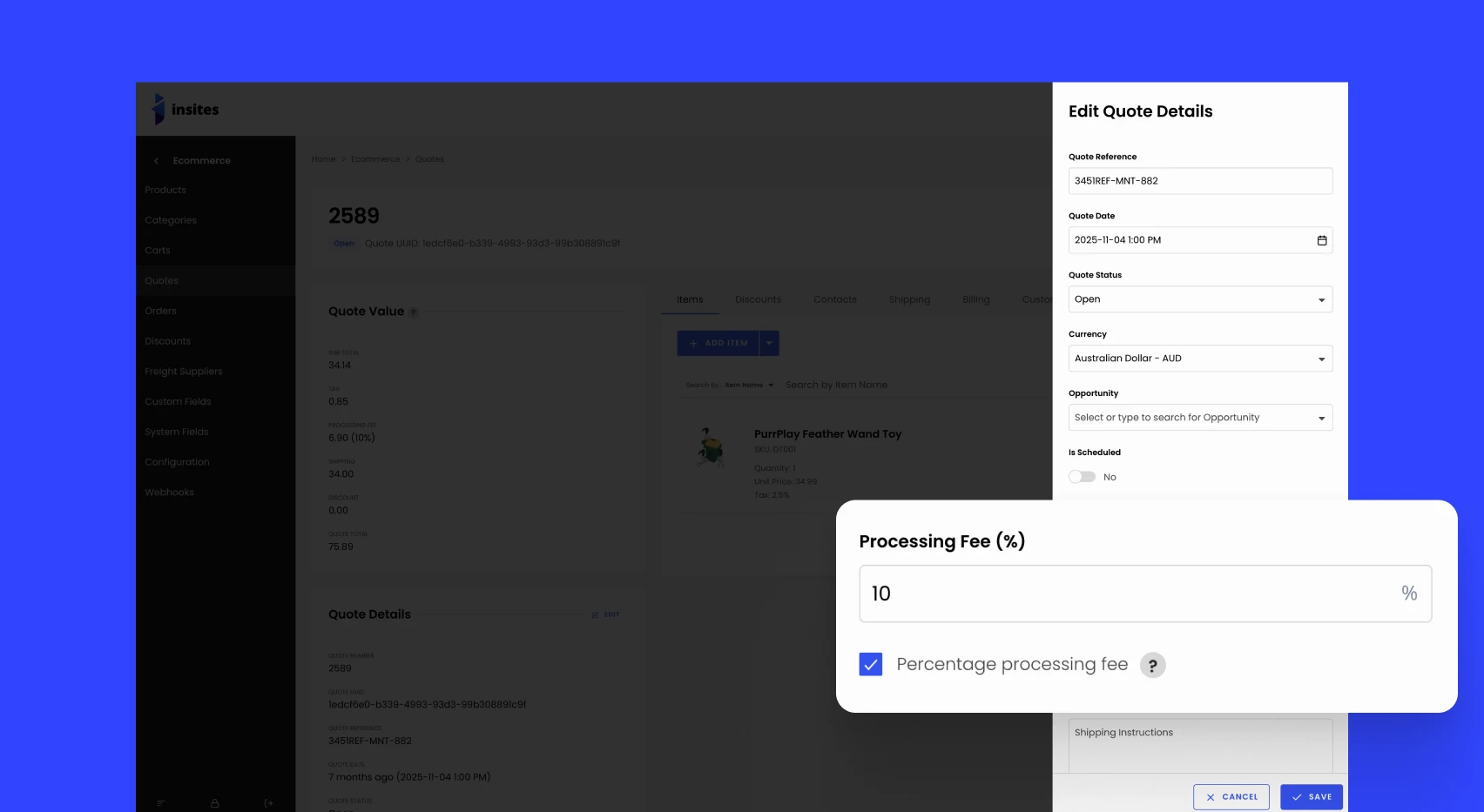
We’ve introduced powerful upgrades to the Insites component library, giving you more control and flexibility in building. The ins-modal now supports full-height scrolling for smoother content display when modal content exceeds the viewport. We’ve also added an options-only attribute to the ins-button, making creating clean, icon-only buttons easier when both icons and options are present.
You’ll find new styling options like outlined, outline-color and more for ins-tag. The ins-credit-card component has been expanded with new attributes, including tag, tag-icon, tag-light, tag-outlined, tag-color, tag-font-color, and tag-background-color. Buttons now offer even more customization with attributes like options, options-icon, options-color, expired-label, and label tweaks.
Lastly, ins-gallery gets a boost with a new insChange event (triggered when slides change) and a new activate(index) method for manually setting the active slide. These updates help you build more interactive, dynamic interfaces with ease.
Visit our change log documentation to view more details.

Try Insites for as long as you like with our free starter plan and free staging instances.
Then purchase a production instance when you are ready to go live.